Design and product decisions across roughly 900 Unacademy content and campaign pages — templates, launches and conversion flows built to drive sales on a platform serving 3M+ users. Every page was designed desktop-first: students studied on laptops, Unacademy-provided or their own, on the advice of Unacademy’s own content and educator teams. Then my own products, where every visual call was mine.
Screens shown at desktop fold — expand any to scroll the full page.
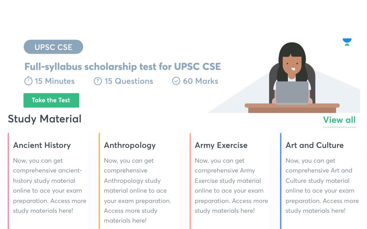
Unacademy's highest-traffic exam hub, serving three jobs at once: rank on Google, convert visitors to courses, and navigate a huge content library. The old page was a flat wall of near-identical study-material tiles with nothing prioritised.
Led the redesign end-to-end at Envigo (2023).
Before
Before — a flat wall of study-material tiles
Before — a flat wall of study-material tilesAfter
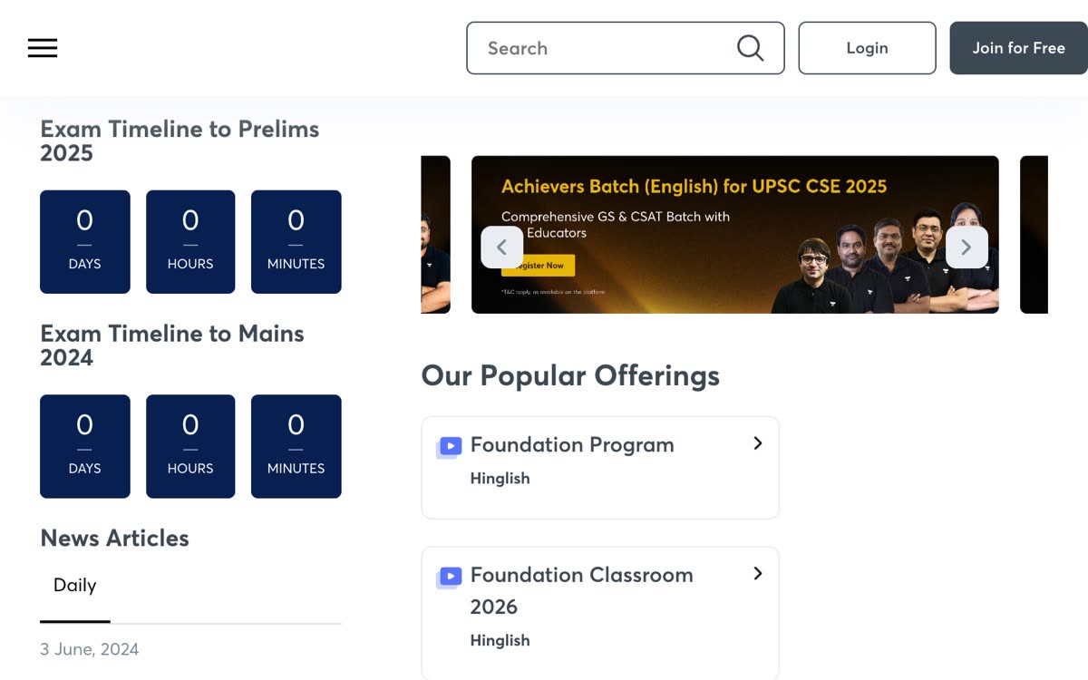
After — habit rail left, commercial column right
After — habit rail left, commercial column right
Decisions
A 70–30 split with a sidebar that never existed before
The new 30% rail collects exam countdowns, daily news, most-viewed pages and contact in one place, so students stopped hopping between pages to assemble their daily prep.
Structural conversion instead of a popup
Course offerings moved into a card grid near the top and the old discount popup was dropped — the commercial column earns attention rather than interrupting.
What I'd change today: make the exam countdown timers calendar-driven so they auto-advance to the next exam date — a hardcoded date can go stale and quietly damage the trust the timers were built to create.
A high-intent landing page for one-on-one UPSC mentorship. The visitor is deciding whether to pay, so every objection has to be answered without them leaving the page.
Landing-page design at Envigo.
Sticky mentor rail and section nav in motion● Recording
Sticky mentor rail and section nav in motion
Decisions
A mentor video + CTA rail pinned through scroll
The right rail stays fixed as you read — the mentor's video and the enrol / book-a-session actions are always one glance away, because intent is highest on this page.
Positioning carried by a design detail
The hero strikes through 'Friend' and 'Family Member' to frame the mentor as replacing informal advice — the message lands in a visual cut, not a paragraph.
A sticky section nav for a long page
Overview / Mentor / Benefits / Pricing / Free Resources pills let a decision-stage visitor jump straight to the objection they need settled.
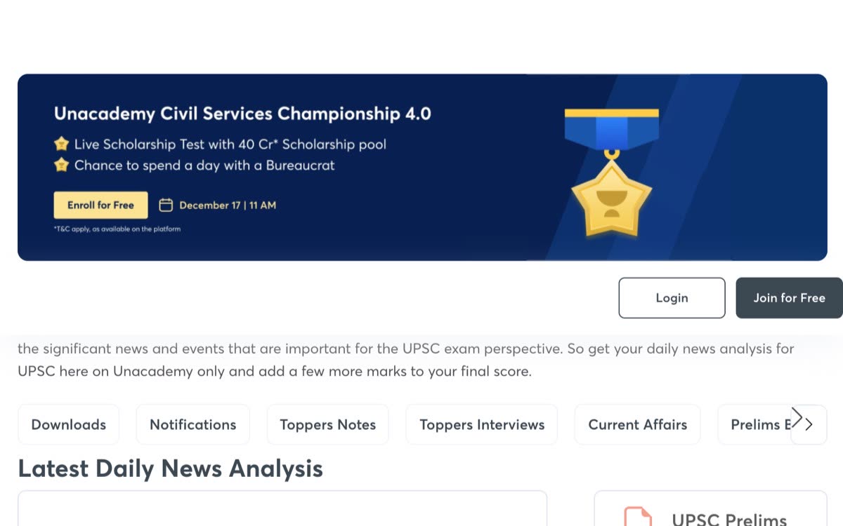
UPSC aspirants read current-affairs analysis every single day — a page visited out of routine, not curiosity. It had to be calm enough to read for twenty minutes.
Designed the reading-surface pattern at Envigo.
The calm reading register — archive rail and story taxonomy
The calm reading register — archive rail and story taxonomy
Decisions
A deliberate two-register colour system
High-contrast colour lifted retention on landing pages, so I reserved it for those — reading surfaces like this one stayed white and quiet, legible for a long sitting.
A habit page that doubles as an archive
A month-based archive rail plus a per-story card taxonomy, so a daily-visit page also works as a reference back-catalogue.
Unacademy launched programmes constantly — every launch needed pages, fast. Instead of designing each one, I built master pages the team cloned per launch, and helped design the internal CMS used to generate client pages in bulk (Hertz, Thrifty, Dollar, IndusInd Bank — internal tooling, described but not shown).
Designed the master templates and cloning workflow at Envigo.
Two different templates, same system — both mine
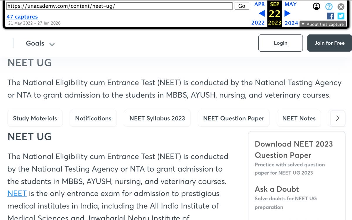
Reference hub template
NEET-UG reference hub
NEET-UG reference hubRevision-batch template
Re-NEET 2026 revision batch
Re-NEET 2026 revision batch
Decisions
One reference-hub template per exam, cloned per launch
A dense, repeatable structure (dates, syllabus, marking scheme, notifications) so students build muscle memory across exams, and the team ships a launch in hours instead of designing from scratch.
The template encodes the colour system
Campaign clones inherit the high-contrast register, reference clones the calm reading register — the system stays consistent without anyone policing it.
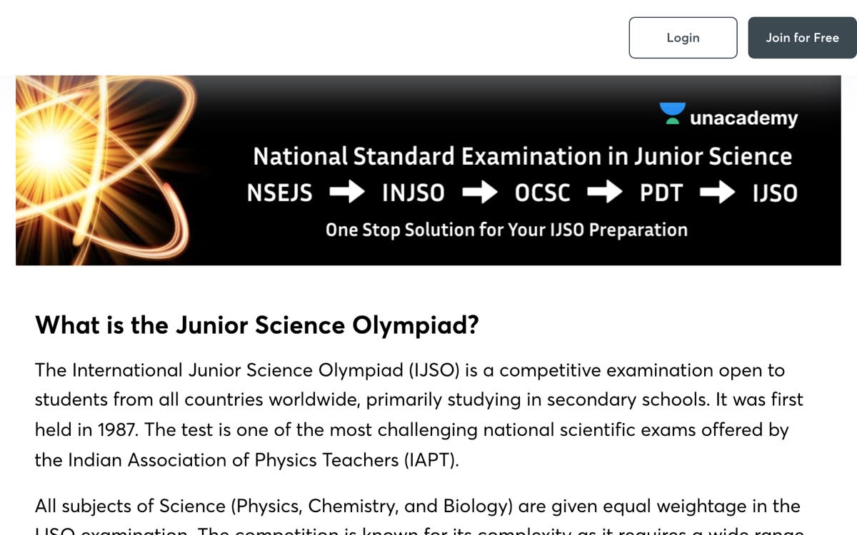
A campaign landing page for the Junior Science Olympiad — the high-contrast half of the two-register colour system.
Campaign-register template at Envigo.
The high-contrast campaign register
The high-contrast campaign register
Decisions
A diagram that explains a confusing multi-stage exam
Dark hero with a custom science illustration and an exam-progression flow (NSEJS → INJSO → OCSC → IJSO) — the page makes a bewildering five-stage system legible in one glance.
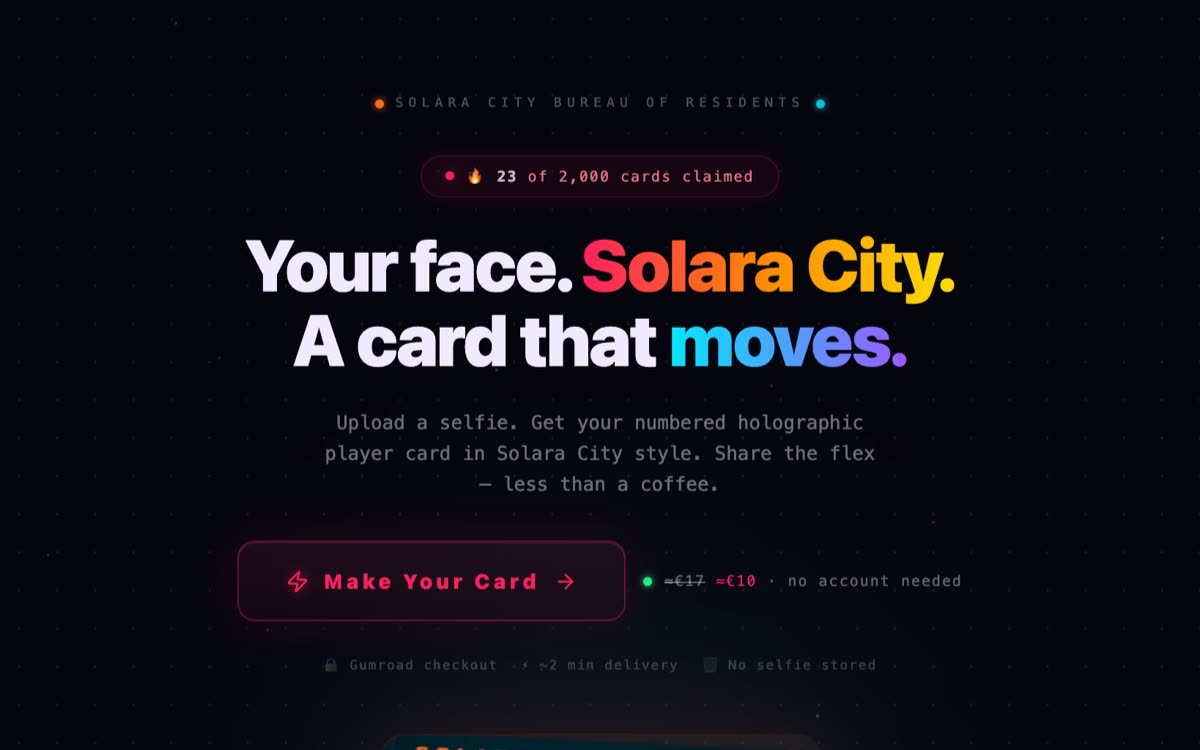
A paid product: a selfie becomes a holographic cyberpunk "resident ID card" — Gemini for moderation, fal.ai for image and video generation, one-time payment, no account, under two minutes end to end.
Everything — identity, product, code, launch.
The holographic ID card identity
The holographic ID card identity
Decisions
A neon-on-dark holographic identity
Built for the GTA VI pre-order moment — the card had to read as a flex worth sharing, not a utility.
Designed for the TikTok frame
The card was composed to look good inside a vertical video, because organic TikTok was the distribution plan — 31.7K views on a zero-follower account, 400+ visitors in three days.
A spec prototype pitched to an Irish fintech: finance teams distrust black-box AI invoice extraction, so trust becomes an interaction-design problem, not a model one.
Hover an extracted field → its source is highlighted on the invoice● Recording
Hover an extracted field → its source is highlighted on the invoice
Decisions
Hover-to-locate spatial mapping
Hovering any extracted field draws an animated bounding box over its exact source coordinates on the original PDF — visual proof instead of blind trust.
Confidence, surfaced per field
High / Medium / Low badges on every field, plus an assistant note that flags the one low-confidence value before you post it — the UI tells you exactly where to look.
The opposite skill from Solara: disappearing into someone else's design language. An unsolicited improvement prototype for Supabase's most-visited docs page.
Everything — research, design, build, deploy.
The widget, live inside the recreated docs shell● Recording
The widget, live inside the recreated docs shell
Decisions
Design tokens lifted from production CSS
Extracted supabase.com's own tokens so the widget reads as a native docs component, indistinguishable from the real thing.
The smallest possible intervention
A before/after toggle proves nothing else on the page changed — the fix is the widget, and only the widget.
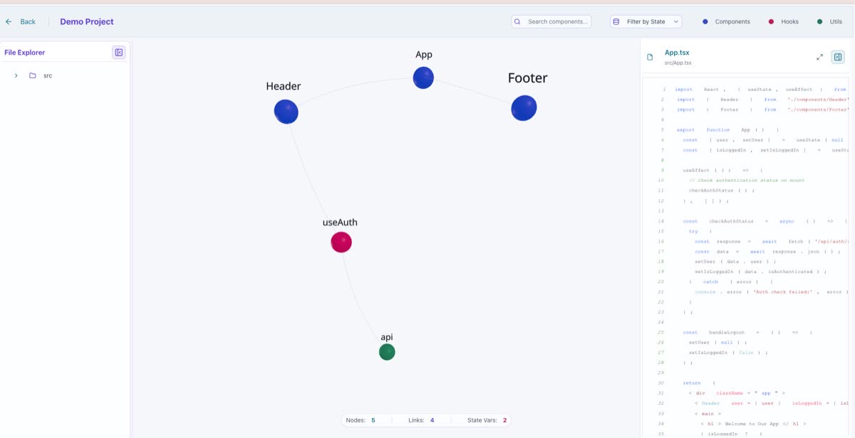
File Explorer on the left, the 3D graph centred as the main stage, and a Code Viewer on the right that opens for whatever file or node you select — the graph never has to double as a code editor.
Legibility over spectacle
Colour-coding by node type plus debounced search and filtering — a 500-node graph is only useful if you can isolate what you care about.
When 3D earns its keep
The third dimension reveals cluster shapes at a glance; for precise reading it can be spectacle — naming that trade-off is part of the design.